New Work in Small Board Book
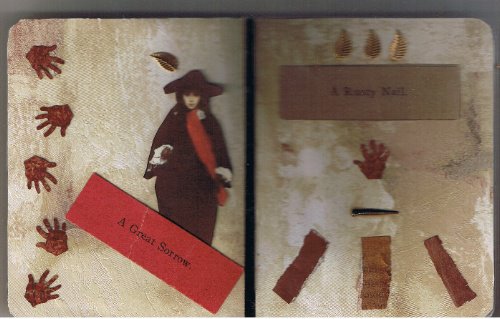 Pages one and two: the first of three completed spreads. This was a little difficult to scan--hence the blurriness--because of the dimensional nail on page two.
This set of pages is understated in terms of color and simple in layout compared to the two sets that follow. In this way, it feels only remotely related to the next spreads.
The backgrounds of these pages are from wallpaper samples. The little hands were punched out of rusty red samples. I snipped the small gold leaves off of one of my ankle bracelets. Why arrange them in three's? (Good things come in three's? Bad things as well?) The two "statements" are from a vintage/antique parlor game where a zany story is built from slips drawn from a box, and the rusty nail is quite old and real.
Is there story continuity? Not exactly. Perhaps a spider web thread of one.

Is there story continuity? Not exactly. Perhaps a spider web thread of one.
This little AB was my first creative work after my father's passing. I was happy to be doing anything at all creative and enjoyed the process.
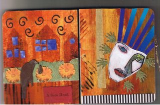
I like the liveliness of this spread, the strong contrasting colors, the stillness/groundedness of the left side (again see three's in the flowers?). I like the bit of kinetic energy on the right side that leads (or will lead) into the next spread.
I like the liveliness of this spread, the strong contrasting colors, the stillness/groundedness of the left side (again see three's in the flowers?). I like the bit of kinetic energy on the right side that leads (or will lead) into the next spread.
I was doodling in a magazine and painted the face with white acrylics, tinting it with colored pencils. The blue strips were made from a hunk of a gradient blue magazine clipping. I clip colors and shapes when I'm looking for something meditative to do.
I sometimes have little patience for glue. Most of this book was assembled using two-way tape.
I have a fondness for black and white stripes and checks. I almost always cut off the little striped postage blocks (or whatever they are called) found on mail in subscription cards. The stripes at the bottom of the right page came from a few of these "postage blocks."
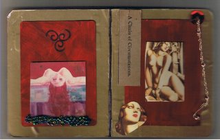 At pages seven and eight the subject has "arrived" so to speak. The earlier pages were part of a journey. That said, two spreads remain to be created: the set preceding these pages and the final set that follows.
 At pages seven and eight the subject has "arrived" so to speak. The earlier pages were part of a journey. That said, two spreads remain to be created: the set preceding these pages and the final set that follows.
 I am not pleased with the gold paper I chose for the background of these pages. It's too flimsy and thin. I can, however, always create these pages again. The beads at the bottom of the picture on the left page are not as dark as they seem here. The colors are reminiscent of the blues and greens of water, and I like the weight they lend to the bottom edge of the picture.
The chain that dangles from the right? Another unwanted ankle bracelet put to better use.
To give some perspective on the size of this little book, the red backgrounds on these final two pages were painted on playing cards.
posted by Divine Synchrondipity at 11:44 PM
![]()
![]()


2 Comments:
I love the face in the second one. Very dramatic color and expression.
I was sad for you to read about your dad's passing. Perhaps some art-time will bring some goodness to your heart wherever you might need it.
Thank you. I was pleased with the way it turned out too. (Unfortunately, I glued the original into this AB so I'll have to recreate it for any future use.)
I like the vibrancy of the colors in the page 3-4 spread, and the kinetic feel of that right hand page.
Thank you for your condolences. It's been rough. Yes, creating art is always healthy for me, and I really need to take more time to indulge in it.
Post a Comment
<< Home